Orbit - Scifi Bootstrap 4 HTML Theme DEMO
Table of Contents
- Fonts & Colors
- Containers & Backgrounds
- Alerts
- Badges
- Breadcrumbs
- Buttons & Links
- Cards
- Carousel
- Collapse / Accordion
- Dropdowns
- Forms
- Input groups
- Jumbotron
- List groups
- Modals
- Navs (Tabs, Pills, Navbar, Megamenu)
- Pagination
- Popovers & Tooltips
- Progress bars
- Spinners
- Toasts
- Tables
- Galaxy Map Controls
- Image Utilities
Fonts & Colors
Headline 1
Headline 2
Headline 3
Normal text. Or bold and italic.
And success, warning, danger and highlight colors.
You can also use dark & light.
The Bootstrap contextual colors secondary & info default either to the highlight or the primary color.
And some small text.
Headline Alert
1234567890
1234567890
Font Awesome icon font
Use fa fa-icon or fas fa-icon as a class for solid icons:
far fa-icon for regular icons:
And fab fa-icon for brand icons:
This is how an unknown icon looks:
And animated icons:
Bootstrap typography
General Typography
h1. Bootstrap heading
h2. Bootstrap heading
h3. Bootstrap heading
h4. Bootstrap heading
h5. Bootstrap heading
h6. Bootstrap heading
Fancy display heading With faded secondary text
Display 1
Display 2
Display 3
Display 4
Lead text: Vivamus sagittis lacus vel augue laoreet rutrum faucibus dolor auctor. Duis mollis, est non commodo luctus.
You can use the mark tag to highlight text.
This line of text is meant to be treated as deleted text.
This line of text is meant to be treated as no longer accurate.
This line of text is meant to be treated as an addition to the document.
This line of text will render as underlined
This line of text is meant to be treated as fine print.
This line rendered as bold text.
This line rendered as italicized text.
attr
HTML
Blockquotes
Blockquote: Lorem ipsum dolor sit amet, consectetur adipiscing elit. Integer posuere erat a ante.
Blockquote center: Lorem ipsum dolor sit amet, consectetur adipiscing elit. Integer posuere erat a ante.
Blockquote right: Lorem ipsum dolor sit amet, consectetur adipiscing elit. Integer posuere erat a ante.
Lists
- List
- Consectetur adipiscing elit
- Integer molestie lorem at massa
- Facilisis in pretium nisl aliquet
- Nulla volutpat aliquam velit
- Sublist
- Purus sodales ultricies
- Vestibulum laoreet porttitor sem
- Ac tristique libero volutpat at
- Faucibus porta lacus fringilla vel
- Aenean sit amet erat nunc
- Eget porttitor lorem
- List unstyled
- Consectetur adipiscing elit
- Integer molestie lorem at massa
- Facilisis in pretium nisl aliquet
- Nulla volutpat aliquam velit
- Sublist gets styles
- Purus sodales ultricies
- Vestibulum laoreet porttitor sem
- Ac tristique libero volutpat at
- Faucibus porta lacus fringilla vel
- Aenean sit amet erat nunc
- Eget porttitor lorem
- List inline
- Phasellus iaculis
- Nulla volutpat
Code
For example,<section> should be wrapped as inline code.
                        <p>Code block here...</p>
                        <p>And another line of sample text here...</p>
Variable: y = mx + b
This text is meant to be treated as sample output from a computer program.
Keyboard input:
To switch directories, type cd followed by the name of the directory.
To edit settings, press ctrl + ,
Containers & Backgrounds
bg-primary
You can also get an element to span the whole viewport width with container-fullwidth. Here it is used to create a fullwidth background and container-width text.
bg-highlight
You can also get an element to span the whole viewport width with container-fullwidth. Here it is used to create a fullwidth background and container-width text.
bg-success
You can also get an element to span the whole viewport width with container-fullwidth. Here it is used to create a fullwidth background and container-width text.
bg-warning
You can also get an element to span the whole viewport width with container-fullwidth. Here it is used to create a fullwidth background and container-width text.
bg-danger
You can also get an element to span the whole viewport width with container-fullwidth. Here it is used to create a fullwidth background and container-width text.
bg-light
You can also get an element to span the whole viewport width with container-fullwidth. Here it is used to create a fullwidth background and container-width text.
bg-dark
You can also get an element to span the whole viewport width with container-fullwidth. Here it is used to create a fullwidth background and container-width text.
Alerts
Badges
Example heading New
Example heading New
Example heading New
Example heading New
Example heading New
Example heading New
Primary Secondary Highlight Success Danger Warning Info Light Dark
Primary Secondary Highlight Success Danger Warning Info Light Dark
Primary Secondary Highlight Success Danger Warning Info Light Dark
Icon buttons
Small & large buttons
Text Links
Normal link Active linkButton groups
Cards
Standard card.
The standard card features a gradient from top to bottom and you can add optional highlights to the corners.
The standard card features a gradient from top to bottom and you can add optional highlights to the corners.
Notice card.
The notice card fades to black toward the right, but is held together by a strong border at the bottom.
The notice card fades to black toward the right, but is held together by a strong border at the bottom.
Solid card.
The solid card has a transparent background without a gradient. It also shows alternative line shaped corner highlights.
The solid card has a transparent background without a gradient. It also shows alternative line shaped corner highlights.
Cards with images & other elements
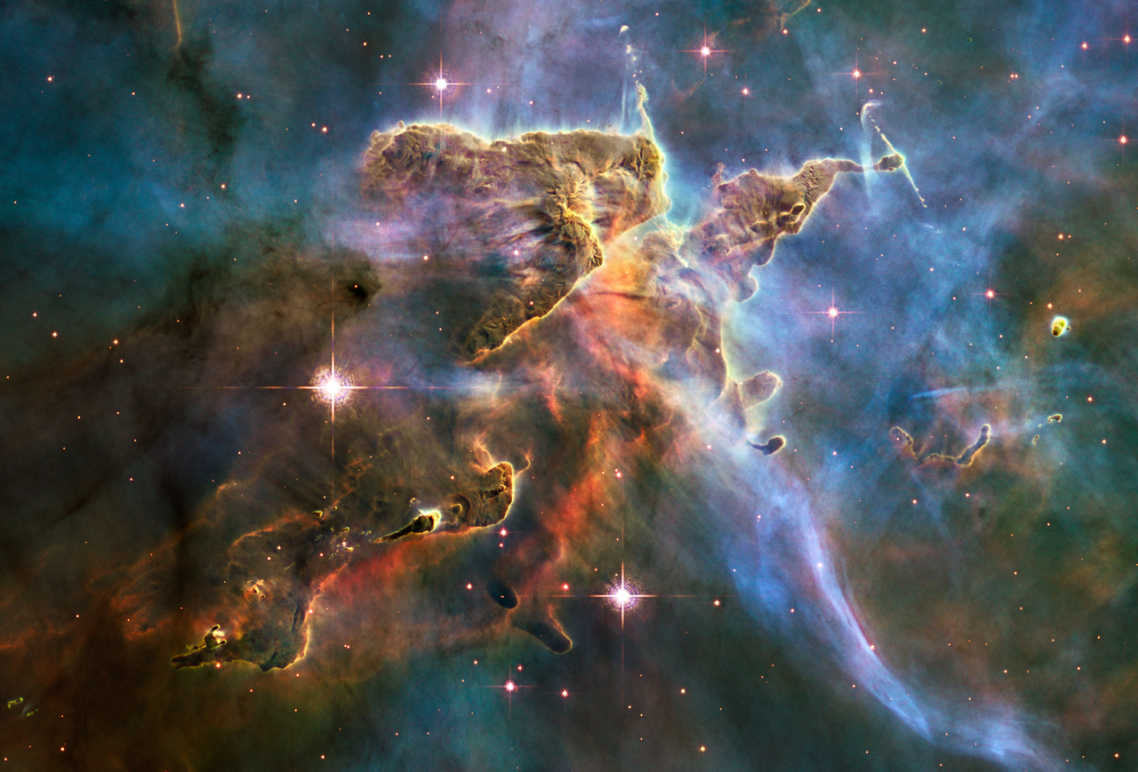
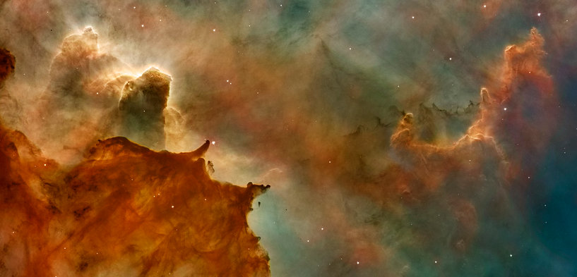
Carina Nebula
The "Mystic Mountains"
The Hubble Space Telescope captured this view of the Carina Nebula. It was quickly dubbed the "Mystic Mountains".
Read more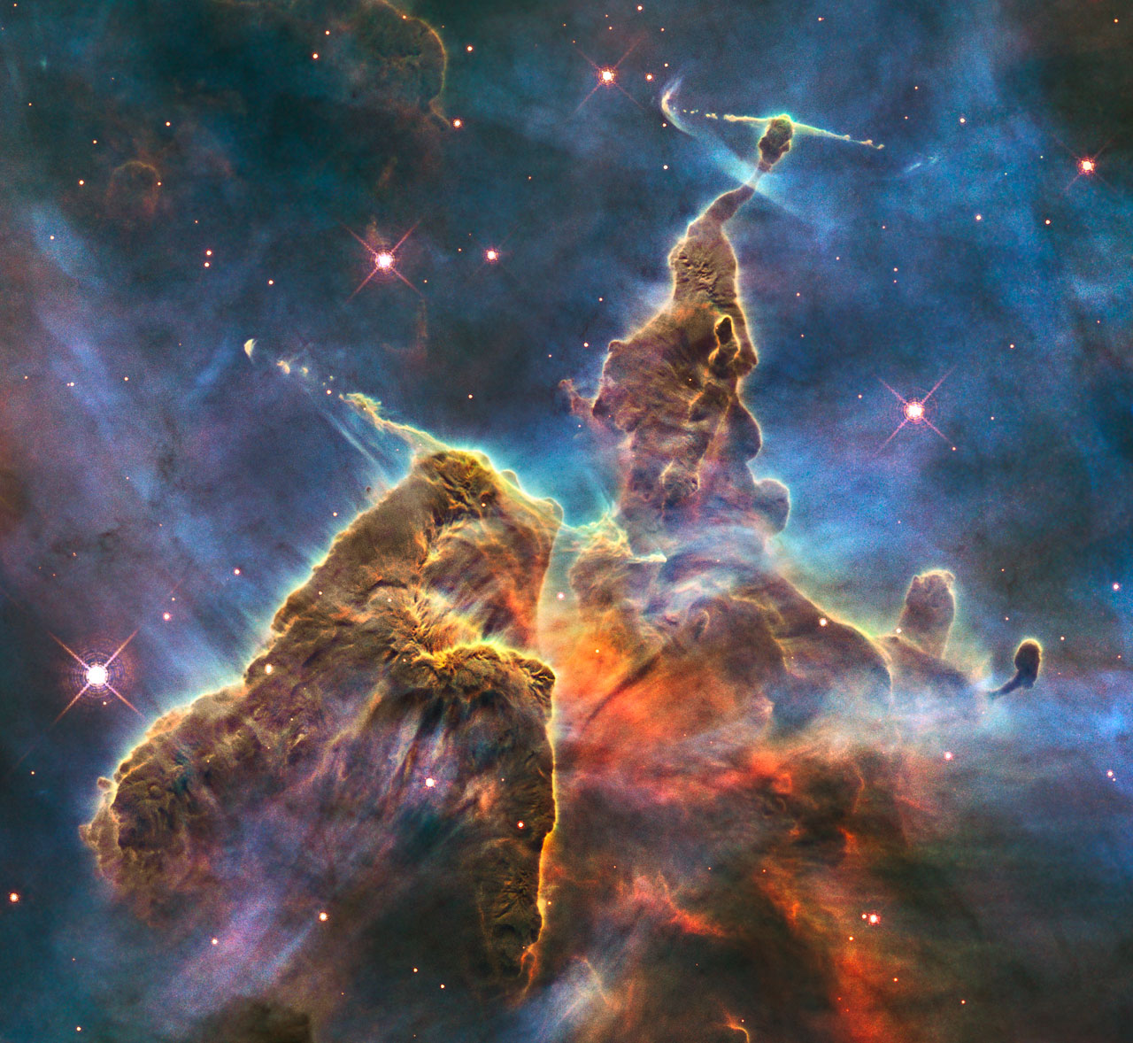
Carina Nebula
The "Mystic Mountains"
The Hubble Space Telescope captured this view of the Carina Nebula. It was quickly dubbed the "Mystic Mountains".
Read more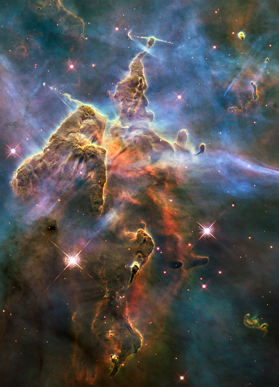
You can still use card-body, but it will be below the card overlay, so buttons won't work.
You can't click me
Featured
Carina Nebula
The "Mystic Mountains"
The Hubble Space Telescope captured this view of the Carina Nebula. It was quickly dubbed the "Mystic Mountains".
Read moreHorizontal cards
You can use the .convert-to-bg class on images in horizontal cards, so they always fill up the available space (parts of the image may be cut off).
Carina Nebula
The "Mystic Mountains"
The Hubble Space Telescope captured this view of the Carina Nebula. It was quickly dubbed the "Mystic Mountains".
Read more
Carina Nebula
The "Mystic Mountains"
The Hubble Space Telescope captured this view of the Carina Nebula. It was quickly dubbed the "Mystic Mountains".
Read moreColored cards
Header
Colored cards
bg-primary
You can use the background color utilities with all card types. But it looks best with the solid card.
Read moreHeader
Colored border
bg-primary & border-primary
You can also give the cards a darker border color (no transparency).
Read moreHeader
Colored cards
bg-highlight
You can use the background color utilities with all card types. But it looks best with the solid card.
Read moreHeader
Colored cards
bg-success & border-success
You can use the background color utilities with all card types. But it looks best with the solid card.
Read moreHeader
Colored cards
bg-warning
You can use the background color utilities with all card types. But it looks best with the solid card.
Read moreHeader
Colored cards
bg-danger & border-danger
You can use the background color utilities with all card types. But it looks best with the solid card.
Read moreHeader
Header
Header
Colored cards
bg-dark
You can use the background color utilities with all card types. But it looks best with the solid card.
Read moreHeader
Colored cards
bg-light
You can use the background color utilities with all card types. But it looks best with the solid card.
Read moreCard groups & decks
These offer very little control for responsive design. Especially on smaller screens they will be way too narrow. I prefer using the normal grid (with the .h-100 utility for equal height cards).
Card title
This is a wider card with supporting text below as a natural lead-in to additional content. This content is a little bit longer.
Card title
This card has supporting text below as a natural lead-in to additional content.
Card title
This is a wider card with supporting text below as a natural lead-in to additional content. This card has even longer content than the first to show that equal height action.
Card title
This is a wider card with supporting text below as a natural lead-in to additional content. This card has even longer content than the first to show that equal height action.
Card title
This is a longer card with supporting text below as a natural lead-in to additional content. This content is a little bit longer.
Last updated 3 mins ago
Card title
This card has supporting text below as a natural lead-in to additional content.
Last updated 3 mins ago
Card title
This card has supporting text below as a natural lead-in to additional content.
Last updated 3 mins ago
Card title
This is a wider card with supporting text below as a natural lead-in to additional content. This card has even longer content than the first to show that equal height action.
Last updated 3 mins ago
Card title
This is a wider card with supporting text below as a natural lead-in to additional content. This card has even longer content than the first to show that equal height action.
Last updated 3 mins ago
Carousel
First slide label
Nulla vitae elit libero, a pharetra augue mollis interdum.
Second slide label
Lorem ipsum dolor sit amet, consectetur adipiscing elit.
Third slide label
Praesent commodo cursus magna, vel scelerisque nisl consectetur.
Collapse / Accordion
Lorem ipsum dolor sit amet, consectetur adipiscing elit, sed do eiusmod tempor incididunt ut labore et dolore magna aliqua. Ut enim ad minim veniam, quis nostrud exercitation ullamco laboris nisi ut aliquip ex ea commodo consequat. Duis aute irure dolor in reprehenderit in voluptate velit esse cillum dolore eu fugiat nulla pariatur. Excepteur sint occaecat cupidatat non proident, sunt in culpa qui officia deserunt mollit anim id est laborum.
Lorem ipsum dolor sit amet, consectetur adipiscing elit, sed do eiusmod tempor incididunt ut labore et dolore magna aliqua. Ut enim ad minim veniam, quis nostrud exercitation ullamco laboris nisi ut aliquip ex ea commodo consequat. Duis aute irure dolor in reprehenderit in voluptate velit esse cillum dolore eu fugiat nulla pariatur. Excepteur sint occaecat cupidatat non proident, sunt in culpa qui officia deserunt mollit anim id est laborum.
Lorem ipsum dolor sit amet, consectetur adipiscing elit, sed do eiusmod tempor incididunt ut labore et dolore magna aliqua. Ut enim ad minim veniam, quis nostrud exercitation ullamco laboris nisi ut aliquip ex ea commodo consequat. Duis aute irure dolor in reprehenderit in voluptate velit esse cillum dolore eu fugiat nulla pariatur. Excepteur sint occaecat cupidatat non proident, sunt in culpa qui officia deserunt mollit anim id est laborum.
Dropdowns
The button colors can be changed, but the dropdown-menu will always have the same color.
Small dropdown
Forms
Standard form
Form inline
Compact input fields
Input groups
@
@example.com
https://example.com/users/
$
.00
With textarea
Small
Default
Large
Jumbotron
Hello, world!
This is a simple hero unit, a simple jumbotron-style component for calling extra attention to featured content or information.
It uses utility classes for typography and spacing to space content out within the larger container.
Learn moreFluid jumbotron
This is a modified jumbotron that occupies the entire horizontal space of its parent.
List groups
- Cras justo odio
- Dapibus ac facilisis in
- Morbi leo risus
- Porta ac consectetur ac 11
- Vestibulum at eros 7 List group link (active) List group link List group link (disabled)
list group flush
- Cras justo odio
- Dapibus ac facilisis in
- Morbi leo risus
List group horizontal
- Cras justo odio
- Dapibus ac facilisis in
- Morbi leo risus
List group colors
- A simple primary list group item
- A simple secondary list group item
- A simple info list group item
- A simple highlight list group item
- A simple success list group item
- A simple danger list group item
- A simple warning list group item
- A simple light list group item
- A simple dark list group item
A simple primary list group item
A simple secondary list group item
A simple info list group item
A simple highlight list group item
A simple success list group item
A simple danger list group item
A simple warning list group item
A simple light list group item
A simple dark list group item
List group with HTML content
List group item heading
3 days agoDonec id elit non mi porta gravida at eget metus. Maecenas sed diam eget risus varius blandit.
Donec id elit non mi porta.List group item heading
3 days agoDonec id elit non mi porta gravida at eget metus. Maecenas sed diam eget risus varius blandit.
Donec id elit non mi porta.List group item heading
3 days agoDonec id elit non mi porta gravida at eget metus. Maecenas sed diam eget risus varius blandit.
Donec id elit non mi porta.Modals
Tabs
Tab content 1
More lines
More lines
More lines
More lines
More lines
More lines
More lines
More lines
More lines
More lines
More lines
More lines
More lines
More lines
More lines
More lines
More lines
More lines
Tab content 2
More lines
More lines
More lines
More lines
More lines
More lines
Tab content 3
More lines
More lines
More lines
More lines
More lines
More lines
More lines
More lines
More lines
More lines
Tabs (alternative design)
Tab content 1
More lines
More lines
More lines
More lines
More lines
More lines
More lines
More lines
More lines
More lines
More lines
More lines
More lines
More lines
More lines
More lines
More lines
More lines
Tab content 2
More lines
More lines
More lines
More lines
More lines
More lines
Tab content 3
More lines
More lines
More lines
More lines
More lines
More lines
More lines
More lines
More lines
More lines
Pills
Standard (horizontal & vertical)
Navbars
Megamenu & Game Info
Imperium
100 (+0)
750 (-34)
2500 (+0)
+3
2
92 (7348)
Active planet:
Class
M (Marshland)
Population
376/1250 (+1)
7
Production
+10
+0
+0
-11
+0
0 (+0)
Resources
1739 (+8)
265 (+5)
160 (+5)
52 (+2)
0 (+0)
0 (+0)
0 (+0)
0 (+0)
0 (+0)
Pagination
Popovers & Tooltips
Popovers
Tooltips
100%
100%
100%
100%
Progress bars
Spinners
Loading...
Loading...
Loading...
Loading...
Loading...
Loading...
Loading...
Loading...
Loading...
Loading...
Loading...
Loading...
Loading...
Loading...
Loading...
Loading...
Loading...
Loading...
Toasts
This is a toast!
just now
It works like push notifications, e.g. on mobile phones.
Notification
2 seconds ago
Heads up, toasts will stack automatically
Tables
Fully responsive table (check it out on mobile) with tooltips to save space (hover over the resources).
Class
Coordinates
Population
Status
Resources
M
178/39
991
Colonized
by Space Empire
by Space Empire
120%
100%
100%
100%
0%
0%
0%
0%
0%
H
178/39
783
Not colonized
100%
100%
100%
100%
100%
0%
0%
0%
0%
Non-bootstrap table
| # | First | Last | Handle |
|---|---|---|---|
| 1 | Mark | Otto | @mdo |
| 2 | Jacob | Thornton | @fat |
| 3 | Larry | the Bird |
Table
| # | First | Last | Handle |
|---|---|---|---|
| 1 | Mark | Otto | @mdo |
| 2 | Jacob | Thornton | @fat |
| 3 | Larry | the Bird |
Table dark
| # | First | Last | Handle |
|---|---|---|---|
| 1 | Mark | Otto | @mdo |
| 2 | Jacob | Thornton | @fat |
| 3 | Larry | the Bird |
Table header light & dark
| # | First | Last | Handle |
|---|---|---|---|
| 1 | Mark | Otto | @mdo |
| 2 | Jacob | Thornton | @fat |
| 3 | Larry | the Bird |
| # | First | Last | Handle |
|---|---|---|---|
| 1 | Mark | Otto | @mdo |
| 2 | Jacob | Thornton | @fat |
| 3 | Larry | the Bird |
Table striped (light/dark)
| # | First | Last | Handle |
|---|---|---|---|
| 1 | Mark | Otto | @mdo |
| 2 | Jacob | Thornton | @fat |
| 3 | Larry | the Bird |
| # | First | Last | Handle |
|---|---|---|---|
| 1 | Mark | Otto | @mdo |
| 2 | Jacob | Thornton | @fat |
| 3 | Larry | the Bird |
Table bordered (light/dark)
| # | First | Last | Handle |
|---|---|---|---|
| 1 | Mark | Otto | @mdo |
| 2 | Jacob | Thornton | @fat |
| 3 | Larry the Bird | ||
| # | First | Last | Handle |
|---|---|---|---|
| 1 | Mark | Otto | @mdo |
| 2 | Jacob | Thornton | @fat |
| 3 | Larry the Bird | ||
Table borderless (light/dark)
| # | First | Last | Handle |
|---|---|---|---|
| 1 | Mark | Otto | @mdo |
| 2 | Jacob | Thornton | @fat |
| 3 | Larry | the Bird |
| # | First | Last | Handle |
|---|---|---|---|
| 1 | Mark | Otto | @mdo |
| 2 | Jacob | Thornton | @fat |
| 3 | Larry | the Bird |
Table hover (light/dark)
| # | First | Last | Handle |
|---|---|---|---|
| 1 | Mark | Otto | @mdo |
| 2 | Jacob | Thornton | @fat |
| 3 | Larry | the Bird |
| # | First | Last | Handle |
|---|---|---|---|
| 1 | Mark | Otto | @mdo |
| 2 | Jacob | Thornton | @fat |
| 3 | Larry | the Bird |
Table small (light/dark)
| # | First | Last | Handle |
|---|---|---|---|
| 1 | Mark | Otto | @mdo |
| 2 | Jacob | Thornton | @fat |
| 3 | Larry | the Bird |
| # | First | Last | Handle |
|---|---|---|---|
| 1 | Mark | Otto | @mdo |
| 2 | Jacob | Thornton | @fat |
| 3 | Larry | the Bird |
Table colored (light/dark)
| # | First | Last | Handle |
|---|---|---|---|
| 1 | Mark | Otto | @mdo |
| 2 | Jacob | Thornton | @fat |
| 3 | Larry | the Bird |
| # | First | Last | Handle |
|---|---|---|---|
| 1 | Mark | Otto | @mdo |
| 2 | Jacob | Thornton | @fat |
| 3 | Larry | the Bird |
Table (not really) responsive, but scrollable
| # | Heading | Heading | Heading | Heading | Heading | Heading | Heading | Heading |
|---|---|---|---|---|---|---|---|---|
| 1 | Cell | Cell | Cell | Cell | Cell | Cell | Cell | Cell |
| 2 | Cell | Cell | Cell | Cell | Cell | Cell | Cell | Cell |
| 3 | Cell | Cell | Cell | Cell | Cell | Cell | Cell | Cell |
Galaxy Map Controls
Image utilities
There are some useful image classes & scripts.
.convert-to-bg
The class .convert-to-bg adds the image to the parent container as a background image that fills all available space and hides the original. Useful for horizontal cards.
It may cut off some parts of the image.
Carina Nebula
The "Mystic Mountains"
Carina Nebula
The "Mystic Mountains"
Carina Nebula
The "Mystic Mountains"
Carina Nebula
The "Mystic Mountains"
.parallax-container & .parallax-image
The classes .parallax-container & .parallax-image work similar to .convert-to-bg. .parallax-container defines a container where a child image with the class .parallax-image is used as a background image. The styles are different though. The background image is fixed, so it doesn't move when the page is scrolled, creating a parallax effect.
The most common usecase is on fullwidth elements, but it can be used on anything (e.g. containers, columns, cards, etc.).
Fullwidth element inside non-fullwidth container
You can also get an element inside a non-fullwidth container to span the whole viewport width with the class .container-fullwidth. Here it is used to create a fullwidth background and container-width text.
This is useful if you have a complicated page structure and can't get out of your container for just this one element .
Parallax on columns
You can even add the parallax background to columns, cards, etc.
If you use the same image for all elements, you get a nice puzzle/window effect, as you can see here.
Parallax on columns
You can even add the parallax background to columns, cards, etc.
If you use the same image for all elements, you get a nice puzzle/window effect, as you can see here.
Parallax on columns
You can even add the parallax background to columns, cards, etc.
If you use the same image for all elements, you get a nice puzzle/window effect, as you can see here.
.avatar
The .avatar class also creates a background image from a child image. It centers it and makes it circular. There is also an .avatar-lg class to create bigger avatars.
Border color changes inside cards to match the card color.
Border color changes inside cards to match the card color.